Thursday, 12 December 2013
Wednesday, 11 December 2013
Ancillary: Digipak Development
 Above is the first draft of our digipak. Although we like the concept, there are a few changes that we could consider making to improve our work further.
For example, we feel that there is perhaps a little too much text on the digipak. Therefore, we will replace the text on the About the Band page with images of all three performers, to give the impression that there is more space, which is something that we have seen done on other digipak's we have studied. We really like the eye that we have used on the front cover of our digipak, and feel that the eyeball could perhaps be used in other places across our work, which is why we have added it to the centre of the CD pane. We also feel that to create symmetry across the product, a closed eye could be used on the back pane, where we presently have no image.
Overall, I feel that our digipak is progressing well, and that the final product should look impressive.
Friday, 29 November 2013
Ancillary Task: Finished Website
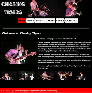
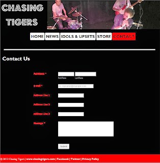
The link to our final website can be found here: chasingtigers.mbdesignsolutions.co.uk
Overall, I feel that our website was very successful, as we have taken into account some of the many conventions that are popular with websites of this genre. Our website's colours and themes reflect those that are present in all of our other products, including our digipak and our music video, which helps to create brand familiarity with our audience. The website includes social network integration, clear navigation and a news feed, which are all things we found when studying websites by other bands in the genre.
Ancillary Task: Analysis of Indie-Rock Websites
The Beatles website, which can be seen above, is a good example of an indie-rock website. The website uses a scrolling banner to show the latest news articles, with links to other websites. The site features a search bar, where visitors can search for Beatles music, along with a merchandise store, which I feel we should try and incorporate into our website. This site also encourages visitors to interact using social media, giving people the opportunity to get more involved. This provides the ideal base for fans, who want to find out more about the band, and the design makes the site easy to navigate. Furthermore, the site uses responsive web design, so that it adapts and fits to any browser site, meaning it can be viewed on a variety of platforms, making it accessible to a wide audience.
The Coldplay website is not dissimilar to the one that I will create for our project. The website features the navigation bar at the top, whilst showing the latest news along the right hand side, and highlighted articles, including a twitter feed, along the left. The band's video is a key focus of the page, which is something that we could consider using, to link our products together. In addition, the colour schemes used on the website tie in with others across other products, which is again something that we could consider incorporating.
The Oasis website uses a photo focus as the banner at the top, which is something that I will consider using on our website. This creates a focus, and shows how popular the band are. The navigation is clear, and the colours used compliment each other well, perhaps giving a more professional feel that the Coldplay website. All of the neccessary information is clearly displayed, making it easy for fans to navigate the website. I will try to ensure that I incorporate elements from the design of this page into our website.
Wednesday, 27 November 2013
Conventions of a Digipak
The Mumford & Sons digipak above is a good example of a minimalist Digipak. The front cover features an album photo cover, with the band name and album name at the bottom of the picture. This shows how the band wish for the photo to be the main selling attraction of the album, and hope that the style of photography will become associated with the band. The rear cover continues in the same theme, with a very minimalist look, and the tracks of the album being shown in the same font. Again, the photo is the main focus of this cover, and is perhaps meant to represent the rear of the building shown on the front. This sort of technique is something that we will try and replicate in our digipak.
The minimalist theme is continued on the inside. The inside left cover is blank, and features just a small amount of writing in the centre. As well as drawing attention to the writing, this technique gives the impression that the band have been successful, as they have not had to squeeze information onto this pane, and can afford to spread information out. Another photograph is shown on the centre cover, which again helps people to identify the band with this type of style, whilst the CD holder is found on the right hand panel.
This digipak effectively represents the conventions portrayed in many digipaks of this genre, and we will try and use some of these techniques in our own work.
The second digipak above is for Coldplay's album Viva La Viva, and features a contrasting approach between the inside and outside of the product. The outside, like the Mumford & Sons cover, features a minimalist approach, using a grey background and yellow text, which compliments each other well. The front cover uses just text in the centre, which is a slightly unusual approach, but effective nonetheless. This theme is continued on the rear of the digipak, which simply features a yellow track list and barcode, and the minimalist style is one that we will seek to use in our product.
The inside of the cover is, however, very different, and a sharp contrast to the outside. The inside features a bright, colourful background, and an intertextual reference is used to link to old art pieces by famous artists. The other cover features performance shots of the band, which is very common for digipaks, and again, is something that we will look to incorporate in our product.
The Oasis digipak breaks convention for a Indie-rock digipak, by featuring a picture of an accustic guitar. This digipak gives a slightly older feel, and is representative of a 1980's and 1990's product, with the variety of colours used. The rear of the Digipak shows the track listings, whilst the inside features the CD, with the same style of background continued.
I feel that when creating our digipak, inspiration should not be taken from this product, and instead from the previous two that we have looked at, which more closely represent the conventions of a modern digipak.
Tuesday, 26 November 2013
About the Digipak
Elements of the Digipak:
Images:
- Band images
- Logo for the band?
- Barcode
- Record company logo?
- Main images for front and back covers
Text:
- Band name
- Price, possibly on barcode?
- Song/track list
- Record company information
- CD/Album name
- Extras/bonus tracks?
- Band information
Theme/Design:
- Genre-matching theme (unless going for the unconventional image)
- Suitable packaging to hold different Digiback elements.
Subscribe to:
Posts (Atom)


