
Thursday, 12 December 2013
Wednesday, 11 December 2013
Ancillary: Digipak Development
 Above is the first draft of our digipak. Although we like the concept, there are a few changes that we could consider making to improve our work further.
For example, we feel that there is perhaps a little too much text on the digipak. Therefore, we will replace the text on the About the Band page with images of all three performers, to give the impression that there is more space, which is something that we have seen done on other digipak's we have studied. We really like the eye that we have used on the front cover of our digipak, and feel that the eyeball could perhaps be used in other places across our work, which is why we have added it to the centre of the CD pane. We also feel that to create symmetry across the product, a closed eye could be used on the back pane, where we presently have no image.
Overall, I feel that our digipak is progressing well, and that the final product should look impressive.
Friday, 29 November 2013
Ancillary Task: Finished Website
The link to our final website can be found here: chasingtigers.mbdesignsolutions.co.uk


Overall, I feel that our website was very successful, as we have taken into account some of the many conventions that are popular with websites of this genre. Our website's colours and themes reflect those that are present in all of our other products, including our digipak and our music video, which helps to create brand familiarity with our audience. The website includes social network integration, clear navigation and a news feed, which are all things we found when studying websites by other bands in the genre.
Ancillary Task: Analysis of Indie-Rock Websites

The Beatles website, which can be seen above, is a good example of an indie-rock website. The website uses a scrolling banner to show the latest news articles, with links to other websites. The site features a search bar, where visitors can search for Beatles music, along with a merchandise store, which I feel we should try and incorporate into our website. This site also encourages visitors to interact using social media, giving people the opportunity to get more involved. This provides the ideal base for fans, who want to find out more about the band, and the design makes the site easy to navigate. Furthermore, the site uses responsive web design, so that it adapts and fits to any browser site, meaning it can be viewed on a variety of platforms, making it accessible to a wide audience.

The Coldplay website is not dissimilar to the one that I will create for our project. The website features the navigation bar at the top, whilst showing the latest news along the right hand side, and highlighted articles, including a twitter feed, along the left. The band's video is a key focus of the page, which is something that we could consider using, to link our products together. In addition, the colour schemes used on the website tie in with others across other products, which is again something that we could consider incorporating.

The Oasis website uses a photo focus as the banner at the top, which is something that I will consider using on our website. This creates a focus, and shows how popular the band are. The navigation is clear, and the colours used compliment each other well, perhaps giving a more professional feel that the Coldplay website. All of the neccessary information is clearly displayed, making it easy for fans to navigate the website. I will try to ensure that I incorporate elements from the design of this page into our website.
Wednesday, 27 November 2013
Conventions of a Digipak

The Mumford & Sons digipak above is a good example of a minimalist Digipak. The front cover features an album photo cover, with the band name and album name at the bottom of the picture. This shows how the band wish for the photo to be the main selling attraction of the album, and hope that the style of photography will become associated with the band. The rear cover continues in the same theme, with a very minimalist look, and the tracks of the album being shown in the same font. Again, the photo is the main focus of this cover, and is perhaps meant to represent the rear of the building shown on the front. This sort of technique is something that we will try and replicate in our digipak.
The minimalist theme is continued on the inside. The inside left cover is blank, and features just a small amount of writing in the centre. As well as drawing attention to the writing, this technique gives the impression that the band have been successful, as they have not had to squeeze information onto this pane, and can afford to spread information out. Another photograph is shown on the centre cover, which again helps people to identify the band with this type of style, whilst the CD holder is found on the right hand panel.
This digipak effectively represents the conventions portrayed in many digipaks of this genre, and we will try and use some of these techniques in our own work.

The second digipak above is for Coldplay's album Viva La Viva, and features a contrasting approach between the inside and outside of the product. The outside, like the Mumford & Sons cover, features a minimalist approach, using a grey background and yellow text, which compliments each other well. The front cover uses just text in the centre, which is a slightly unusual approach, but effective nonetheless. This theme is continued on the rear of the digipak, which simply features a yellow track list and barcode, and the minimalist style is one that we will seek to use in our product.
The inside of the cover is, however, very different, and a sharp contrast to the outside. The inside features a bright, colourful background, and an intertextual reference is used to link to old art pieces by famous artists. The other cover features performance shots of the band, which is very common for digipaks, and again, is something that we will look to incorporate in our product.

The Oasis digipak breaks convention for a Indie-rock digipak, by featuring a picture of an accustic guitar. This digipak gives a slightly older feel, and is representative of a 1980's and 1990's product, with the variety of colours used. The rear of the Digipak shows the track listings, whilst the inside features the CD, with the same style of background continued.
I feel that when creating our digipak, inspiration should not be taken from this product, and instead from the previous two that we have looked at, which more closely represent the conventions of a modern digipak.
Tuesday, 26 November 2013
About the Digipak
Elements of the Digipak:
Images:
- Band images
- Logo for the band?
- Barcode
- Record company logo?
- Main images for front and back covers
Text:
- Band name
- Price, possibly on barcode?
- Song/track list
- Record company information
- CD/Album name
- Extras/bonus tracks?
- Band information
Theme/Design:
- Genre-matching theme (unless going for the unconventional image)
- Suitable packaging to hold different Digiback elements.
Monday, 25 November 2013
Audience Feedback
Thomas Robertson, University Media Production Manager:
"A nice range of shots and good use of location, in particular the beach sunset. Lots of thought has obviously gone into camera angles and story boarding and this shows in the final piece. An initial criticism would be a lack of narrative in relation to the song however this is relieved with the photo album at the end of the piece. A very strong video with good reference points coming from the stop start animation and band onstage. Impressive to get that much stagelight working but get the guitarist to wear a darker top next time, dayglow compared to the other two."
Feedback from Social Networking site Facebook:

Overall, we feel that the feedback we received was reasonably positive. The feedback from social networking allowed us to get the views and opinions of people who are in our target audience, gaining the views of people who do, and of people who do not know about media. People also offered some constructive criticism, such as that from ******** Cooke, who suggested that the video is a bit repetitive, with going from the shots of the band to the shots of the narrative and back again. This is something that we hope to address in our second version of the music video.
There were also some good comments that were given about our music video. For example, I am pleased that ******** Cooke noticed the book that the character was carrying, as we were unsure if this would be noticed by an un-briefed audience. Also, it was refreshing to note that Thomas Robertson felt the shot on the beach reflected a sunset - an effect we were hoping to achieve, even though the shot was filmed at 10:00am. Thomas' point about a lack of narrative will also be taken into consideration for the next edit.
"A nice range of shots and good use of location, in particular the beach sunset. Lots of thought has obviously gone into camera angles and story boarding and this shows in the final piece. An initial criticism would be a lack of narrative in relation to the song however this is relieved with the photo album at the end of the piece. A very strong video with good reference points coming from the stop start animation and band onstage. Impressive to get that much stagelight working but get the guitarist to wear a darker top next time, dayglow compared to the other two."
Feedback from Social Networking site Facebook:

Some names have been removed to protect identity
Overall, we feel that the feedback we received was reasonably positive. The feedback from social networking allowed us to get the views and opinions of people who are in our target audience, gaining the views of people who do, and of people who do not know about media. People also offered some constructive criticism, such as that from ******** Cooke, who suggested that the video is a bit repetitive, with going from the shots of the band to the shots of the narrative and back again. This is something that we hope to address in our second version of the music video.
There were also some good comments that were given about our music video. For example, I am pleased that ******** Cooke noticed the book that the character was carrying, as we were unsure if this would be noticed by an un-briefed audience. Also, it was refreshing to note that Thomas Robertson felt the shot on the beach reflected a sunset - an effect we were hoping to achieve, even though the shot was filmed at 10:00am. Thomas' point about a lack of narrative will also be taken into consideration for the next edit.
Friday, 15 November 2013
Research and Music Video Development
Research into our Band
Below is an interview that two members of Chasing Tigers conducted with BBC Radio Norfolk. This gives us a really good insight into the band's background, and will help us to develop our products to suit the band's style and genre.
Development of our Music Video
Below is the first draft of our music video. Please have a look, and give us some feedback in the comments section.
Ancillary Task - Website Plans
Before undertaking any web design task, it is important to carry out thorough plans. The plans for the website that I will create can be seen below:


A navigational plan for my website can be seen below:


House Style
When designing my website, I will endeavour to ensure that the design is kept consistent across all pages. All pages will have a black background with white text, which reflects the style portrayed on other marketing material from the band. The header will feature the band's logo on the left, with the rest of the screen width showing a photo of the band's performance. Under this area, the navigation bar will be shown, which will feature on all pages, allowing easy navigation for the audience from any point within the site. All headings will be written in HTML using the< h1> tag, and, in the CSS file, I will specify that this uses a font size of 2em, and a font of 'Reprise Title'. Similarly, all body text will be written using the <p> tag, and a font of 'Gill Sans MT' will be specified, at font size 1em. The use of 'em' in font size will ensure that the font size remains relative to the size of the browser window, helping to create an enjoyable browsing experience for users on all platforms. I also feel that Reprise Title and Gill Sans MT compliment each other well, creating a professional feel to the website.
Audience & Purpose
My website has been designed to provide information about the band, and provide an online base for fans interested in the band. With this in mind, I feel that the audience for my website is likely to be older teenagers and young adults (14-25), and is likely to be predominantly males, although I shall design my website to be used by a much wider audience range, with simple and intuitive navigation making it possible for those with few IT skills to use my website.
Accessibility for my Audience
I will design my website so that it is accessible for a wide variety of audiences. For example, I will ensure that no advertising banners appear on my website, as these can sometimes appear as genuine buttons, confusing some users, making them press the wrong button. The font sizes I use for my website will also be accessible to the majority of people, using reasonably large sizes and clear fonts, helping to aid navigation, along with the body text, which will be clear to read.
Although the timescales of this project will not make it practical to incorporate Responsive web design, I will consider some elements of this in the production of my site. Responsive web design involves using multiple CSS sheets, and then using HTML code, so that the browser decides which CSS document to use, depending on the size and resolution of the screen. This means that designers can drastically change the way a site looks on a mobile device compared to on a full desktop monitor, excluding some parts of the site, or making other adjustments to fonts and colours, all from one site and base HTML document. Elements of this will be considered with designing my site, ensuring that my website is accessible for all users who view the site.
Tools & Techniques used to Create my Website
When creating my website, I will use Hyper Text Markup Language (HTML) coding. This is the standard language used for the internet, and is compatible with all web browsers. HTML documents load quickly for users, which is partly down to the very small file size, which reduces load on the server. A website designer building a site in HTML will use a variety of tags to define different elements in the site, by starting with the tag, <tag> for example, and ending the section with a closing tag, such as </tag>. For my website, the <p> tag will be used to define paragraph text, whilst< h1> will be used to define headings. All heading information, including metadata, the website title, external style sheet link and JavaScript will be wrapped in the <head> tags, and this tells the browser to load this information before the rest of the page. Where a table needs to be used, I will begin by using the <table> tag, and then <tb> to define the table body, and <tr> to define individual rows. Formatting tags will be used, including <strong> to make contents bold, and <i> to add Italics formatting to text.
In HTML, comments can be added to the code, which makes it easier to understand and edit at a later date. These comments can be written as <!---COMMENT--->, and when surrounded with the <!--- and ---> tags, the browser knows to ignore this information. As I will be writing my website using HTML5, I will be able to take advantage of some of the newer tags, such as the <video> tag, which will be used to insert the video on the Idols & Upsets page.
DIV’s will also be used as containers for my page, to create the main framework and layout of the page. By using DIV ID’s in my HTML, using <div id=”hello”>, I can specify the size, background colour, margins, padding and position of each div individually, via my CSS sheet (discussed later). DIV’s will be used to hold my header logo, image, navigation bar and footer, along with individual elements on each page, ensuring that my website displays as intended on a wide variety of devices.
The use of DIV’s has replaced tables and iFrames which used to be used for layout, but have now become obsolete. DIV’s can contain a mixture of paragraphs, headings & videos, and so are extremely versatile when being used on the internet. Furthermore, DIV Classes can be used on my website, and I will use a class to define the page which is active for my navigation bar, using< class=”active”> in my HTML, and then by defining different formatting in my CSS sheet for this class, the active page will show the down state on my navigation bar.
An external Cascading Style Sheet (CSS) will be used to provide all of the formatting and layout of my website. The use of this makes it easier to change the formatting of my website, as only one CSS sheet must be used for all page of my website. Therefore, to make a change, you must simply edit the CSS document, instead of changing the coding on each HTML document. CSS will be used to specify styling and positioning for HTML elements, ensuring consistent design across all pages. For example, to specify the formatting of all paragraphs, I can simply write ‘p {‘in the CSS sheet, followed by the relevant attributes for the section, such as‘font-size’, ‘font-family’ & ‘padding’. These will be written in the format‘attribute:value;’, and the vital use of a semicolon after the instruction separates the lines of coding. The block of instructions will be finished by using ‘}’, preparing the document for the next instruction. Multiple elements of my HTML will be formatted in CSS, including paragraphs, headings, videos and DIV ID’s, and in CSS, a DIV ID is defined using ‘#DIVID’. In a similar way to HTML, CSS comments will be written, to make the document easier to understand when editing, but with CSS, these will be written in the format /*COMMENT*/, with the /* and */ sections telling the browser to ignore the enclosed piece of text. In the head section of the HTML document, <link rel=”stylesheet”type=”text/css” href=”css.css”> will be used, to tell the HTML document to take its formatting from the correct CSS document. The use of CSS makes the HTML document faster and more efficient, as there is less HTML coding for the browser to implement.
JavaScript will also be used in my website, to provide the interactive elements for my website, including the PayPal eCommerce, video, and the RSS feed. JavaScript elements that I include in my site will be sourced from the internet, so that they are appropriate for the task in hand, and then manipulated for use on my website.
I will also use Really Simple Syndication, or RSS, on the news page of my site, to keep my page updated with latest news. This method easily allows my website to be customised by clients, as it does not require a new HTML page to be uploaded every time news articles need to be added. Furthermore, this is ideal for users, as they may wish to add the RSS feed to apps on their smartphones or tablets, or widgets on their desktop, so that they are always fully up to date with the information from the site.
A navigational plan for my website can be seen below:

Wednesday, 13 November 2013
Ancillary Task: Album Cover
For our album cover, we looked at the way that other bands produced their own. We decided that a lot of these bands used abstratc art or other artistic ideas, especially in the text on the cover as this is usually in a unique font that portrays the 'rock' idea.


For our album cover, we decided that we wanted it to be abstract but still portray the main idea and concept behind the band. We decided to use the tiger idea but use different photoshop effects to overlay the colours onto different images. For the back cover, we decided on a simple idea of just using a leaping tiger drawing from the internet and editing the colours to make it more interesting and appealing to the audience. The text colour is white to make the cover more original and also because the white stands out on the black background and therefore is easy to read.

The images on this CD cover both started off as images from Google, allowing us to use research to gain these secondary sources. I then spent hours on Photoshop editing the images and producing different effects in order to make the images more personal and unique to our album cover. The image of the eye just started off on Google as a picture of a female eye wearing gold make-up. I then edited the tiger colouring into the pupil in order to refer it to the band name, Chasing Tigers. I then added a lighting effect to sharpen the colouring as well as upping the contrast in order to make the colours more effective.
The tiger image on the back cover was also from Google, but I edited it on Photoshop to make it black and white as well as producing a fuzzy background effect to make the background less boring and fit in with the colour scheme of the text and the black frame.
Friday, 1 November 2013
Ancillary Task Preparation: Website
As part of our project, I have decided to utilise my skills in web design to make a promotional website for our band. As well as enabling me to develop my skills, this will be the ideal way to promote our band's album within our genre, as research has shown that a large proportion of our audience use the internet to discover new bands.


A screenshot of the initial developments of our website can be seen above. The header image features the band's logo, and to depict the house styling portrayed in the logo, a simple black and white theme will be continued throughout the website. The header also features a performance shot that we took when we filmed this part of our music video, which instantly gives website visitors a feel of the style portrayed by the band. The navigation bar can then be seen below, which will be shown on every page, enabling easy navigation by the user.
As this website will be built as part of my of one of my BTEC ICT units, I will construct my website using raw HTML and CSS coding, and the coding for the website so far can be seen below.

Performance Shoot Evaluation 25/10/13
This shoot was extremely successful for many reason:
- Massive range of shots due to unlimited time allowing us to use tripods, ladders and handheld cameras which then gave us a good range of low-angle, high-angle and close-up shots of the band performing.
- The performance looks professional as we didn't have to make each individual band member wear headphones in order to play along with the song as we were able to play the song out loud and just sing/play along with it in that way. This means that there was no need for music sheets or lyrics.
- Because we filmed it on the school stage, we were able to have full use of the curtains and the lighting systems in order to make our production look more professional and interesting.
- Bozzy also brought in his own lights and laser systems to add to the production value of the performance shooting (we wanted to use our smoke machine but weren't allowed due to the smoke alarams in school)
- It was also successful because we did it during the half-term holidays, allowing us as much time as we wanted and no interruptions.
- We had a lot of help from people not in our group (Jack - drums, Matt - guitar and Dan - lighting and general help). All these people also brought helpful equipment like Matt's guitar and amplifyer as well as Jack bringing his drumkit in the car all the way from Peterborough for a 9am start.
- Good quality instruments made us look like an actual band and not like cheap copycats, even if we weren't actually producing the song ourselves.
- Multiple run-throughs which meant that we were able to get as many shots as possible as well as to allow us to get to know the song properly and get comfortable with it. This also meant that we have a lot of footage which can only serve to assist us in the final production of our music video.
- Great song to perform as the lyrics are easy to understand and hear, meaning it was easy to perform to, as well as the music being quite audible, allowing Matt and Jack to improvise the music but still make it look and sound as if we were actually the ones performing the song, which will be very helpful for our actual video.
- Jack and Matt both wore white and I (lead-singer) wore a different colour which actually looked quite effective and made me stand out as the key performer, which is quite conventional generally in Indie-rock music videos.
- We planned all the different angles and shots we wanted of each band member or the band as a whole before we started, instead of just putting the camera in loads of different places and improvising a lot in movement and shot types.
- We had one more person to assist us, as when we were getting the high angle shots, Bozzy had to hold the ladder still for Dan so therefore I had to run to turn on the music and get back into position as quickly as I could.
- We had charged the camera instead of having to run it on mains which made the lead get in the way of the dolly, inadvertently interrupting our performance at one point.
- Would have been better if we had planned the lighting sequences before actually filming as only decided to start playing around with the lighting after we had already done about 10 run-throughs of the song.
- Had the music playing louder from the beginning as sometimes it was a little too quiet for Jack on drums to copy it as he couldn't hear it too well over the noise from the drums that he was playing, meaning that occasionally he was a bit too fast or a little behind the actual music.


Cup Technique 2
The video above is another attempt at the cup technique that we will be using in our music video. This time, instead of using black paint, food colouring was used and diluted with the water. This technique worked far more effectively, as the water was black enough so that when the cup was full and the letter was written on the side, it could not be seen.
We will be able to use this adaptation in our music video to improve our results, making the technique more effective
Wednesday, 16 October 2013
Creativity in our Music Video
Intertextuality:
We will not be using intertextuality in our music video as we feel that it will complicate things and we can produce a successful video without producing intertextual links to other media within the promo.
Disjuncture and why we will not be using it:
Our music promo will concentrate on amplifying the lyrcis of our song rather than being completely random like videos that use disjuncture. One example of a music video that uses disjuncture is 'Lazy Song' by Bruno Mars.
We feel that disjuncture is not the correct type of video to use, especially as it does not follow the typical conventions of the genre that we are looking at.
Amplification:
We are going to use amplification for our music video because we feel this is the appropriate one to use because illustrating the lyrics of our song would be fairly difficult as it would require a lot of love scenes, which is something that Matt and I feel is too cliche so we are going to try to do something a bit different whilst still amplifying the moral of the song.
The song is about a rollercoaster type of relationship, so our idea of going on a journey in an effort to 'get off the ride' is hopefully going to be successful and appeal to its audience.
Narrative/Performance:
We are going to use both narrative and performance in our music video as, in terms of the genre, this follows conventions and we do not want our video to be too much like the pop genre which tends to only use narrative in its music promos. We will have a fairly substantial narrative but will cut to performance scenes every so often throughout our music video so as to maintain interest and give that 'rock' feel to the music video with the shots of the drums, guitar and vocalist singing. We do not really like the original music video for the song as we feel that it is slightly boring because it is completely performance-based, therefore making it look unprofessional and rushed so we hope to produce a video that is quite unlike the original promo.
Tuesday, 15 October 2013


Monday, 14 October 2013
Production Timetable
Filming Day One - Wednesday, 23rd October 2013
- Film the production element of our video
- We have allocated a day to this task, so we can take time to set up the stage with backcloths and lighting, and get a good variety of shots
- Jack Spires & Matthew Jones will join James and myself for this day
- 9:30 bus to Peterborough
- Film shots of person walking through the city
- Film shots at train station, including the time lapse section and looking up at the board
- Get 11:52 train to Stamford, which will allow us to get the necessary shots for this part of the video
- Arrive in Stamford at 12:05
- Leave Stamford via Bus at 13:00
- Arrive in Bourne at 13:28
- Backup the morning's shots onto computer & charge camera if necessary
- Travel to Morton fen, and gather the required shots there
- Leave Bourne at approximately 8:00
- Arrive at 9:30 in Skegness
- Spend until 11:30 exploring the area, looking for the best place to film
- Gather the required shots in Skegness
- Leave at 15:00
- Return to Bourne at approximately 16:30
Friday, 11 October 2013
Try-outs: Stop Motion Picture Zoom
We are considering introducing the band and the video by using a stop motion with video match technique - a culmination of many ideas that we have previously attempted. In this technique, stop motion would be used to film someone writing 'Chasing Tigers', and then the page would be flipped over, to reveal an image, that would appear to be sketched. The stop motion would then continue to zoom into the image, and then once the picture fills the screen, this would go into a section that is similar to the cup tryout we attempted a few weeks ago, whereby liquid is drained from a cup to reveal letters written on the outside.
This technique worked very well, and gave a professional effect, that we will be able to consider for use in our video.
This technique worked very well, and gave a professional effect. I feel that this technique would be ideal for use at the beginning of our video, when we could write the name of the band on the sketchbook, and then use the cup animation effect for the words 'Idols & Upsets'.
Wednesday, 9 October 2013
Performer Information and Briefing for Performers
In our music video, we will have three performers:
All of our actors will be given a copy of the costume plan, so that they know what to wear, and look enkeeping with the style portrayed by our chosen genre. This will ensure that a realistic effect is presented in our video, and will also mean that all of the performers look similar, again, adding to the realism.

The performance section of our music video will be performed on our school stage, which can be seen above. The black curtains and sides will allow us give the impression that we are filming in a stage environment, and we will also use the stage lighting, which gives an authentic feel. We have also be able to ascertain some additional lighting equipment, which will enable us to focus on certain instruments at certain points, along with making the silhouette effect easier to achieve. Furthermore, the smooth floor of the stage will allow for successful use of the camera dolly owned by the school, which will make smooth pan shots easier to create, giving a professional feel to our video.
The performers that we are using are accomplished musicians, and so will be able to play the song that we have chosen. This will enable us to get lots of close up shots of these people playing the instruments, and as they will be playing it correctly, it will appear realistic.
To further add to the realism, we will ensure that all of the instruments are connected to amplifiers, as they may be in a traditional band set up. I have experience in live performance sound system setup and maintainence, so I will be able to advise of the equipment that would usually be used in such a situation. In addition, we will set up some of the speakers for use, so that the track can be played at high volume through the system, so that the musicians can still hear the track they are playing whilst performing, which will ensure that they are playing at the right speed and tempo, making editing easier, and ensuring effective lip and instrument syncing occurs.
To enable us to get a wide variety of artistic shots for our video, will will set aside a day for the filming of this section. This will allow us to run through the song many times, focusing on different instruments on each run through, so that when we are editing, we have a wide variety of shot types and angles to choose from. All of the performers will be given notification of this date, and will also be given chance to practice playing the song, so that they are fully prepared before the shoot.
We ask that performers focus on making the performance as realistic as possible, by performing in a way that they may do so in a normal rehearsal or performance situation.
- Jack Spires - Drums
- Matthew Jones - Guitar
- James Craig - Vocals
All of our actors will be given a copy of the costume plan, so that they know what to wear, and look enkeeping with the style portrayed by our chosen genre. This will ensure that a realistic effect is presented in our video, and will also mean that all of the performers look similar, again, adding to the realism.

The performance section of our music video will be performed on our school stage, which can be seen above. The black curtains and sides will allow us give the impression that we are filming in a stage environment, and we will also use the stage lighting, which gives an authentic feel. We have also be able to ascertain some additional lighting equipment, which will enable us to focus on certain instruments at certain points, along with making the silhouette effect easier to achieve. Furthermore, the smooth floor of the stage will allow for successful use of the camera dolly owned by the school, which will make smooth pan shots easier to create, giving a professional feel to our video.
The performers that we are using are accomplished musicians, and so will be able to play the song that we have chosen. This will enable us to get lots of close up shots of these people playing the instruments, and as they will be playing it correctly, it will appear realistic.
To further add to the realism, we will ensure that all of the instruments are connected to amplifiers, as they may be in a traditional band set up. I have experience in live performance sound system setup and maintainence, so I will be able to advise of the equipment that would usually be used in such a situation. In addition, we will set up some of the speakers for use, so that the track can be played at high volume through the system, so that the musicians can still hear the track they are playing whilst performing, which will ensure that they are playing at the right speed and tempo, making editing easier, and ensuring effective lip and instrument syncing occurs.
To enable us to get a wide variety of artistic shots for our video, will will set aside a day for the filming of this section. This will allow us to run through the song many times, focusing on different instruments on each run through, so that when we are editing, we have a wide variety of shot types and angles to choose from. All of the performers will be given notification of this date, and will also be given chance to practice playing the song, so that they are fully prepared before the shoot.
We ask that performers focus on making the performance as realistic as possible, by performing in a way that they may do so in a normal rehearsal or performance situation.


Costume
The costume that we plan on using throughout our music promo is going to be conventional of the music genre. Stereotypical costume for indie-rock music tends to be smart-casual, generally involving casual clothing like t-shirts and jeans combined with smarter clothing like shirts, ties and smart shoes. Here are some examples of indie-rock bands that dress in the conventional manner which we plan on following:
 Fun (left) are one indie-rock band that dress in the conventional indie-rock style. They always dress in this smart-casual way, whether out in public, or performing in their extremely popular music videos as well as when they perform on stage.
 Another band that dress in this fashion are Two Door Cinema Club (right) who, as shown by the image, also dress in the conventional indie-rock way.
 One band that break these conventions is Empire Of The Sun, a definite indie-rock band that use disjuncture to bring interest to their music videos. This is also shown by the way they dress as they also wear odd clothing when performing in order to be unique and break the stereotypical conventions of the genre.
Music Video - Empire Of The Sun
Live Performance - Empire Of The Sun
 Our Costume:

 For our music video, we plan on following the conventions of the genre and dressing in a smart-casual way.
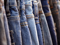
We will require that all actors (aside from the girl in the photo) wear jeans or chinos in our music video. This is because these items of clothing are seen as fairly casual but at the same time they are not too casual to be seen as cheap.


 For the top half of our costume in our music video, we will look at dressing in a fairly smart manner but not too smart as dressing in an office-style is not the conventional fashion for the indie-rock genre. We will perhaps look at wearing a smart shirt but with another piece of clothing to take the 'too smart' look away from it. Some examples of this dress sense would be to wear a plain t-shirt with a blazer, a shirt with a loose tie, a plain t-shirt with an open shirt over the top or we could wear a smart shirt with a neck-scarf to 'loosen up' the smart look a little.
 The shoes that we plan on wearing have to be quite smart to fit in with this look, so trainers and running shoes are out of the question. The best shoes to wear would be smart black or brown shoes but for the narrative part of our music promo, this may not be possible as we do not want to mess up smart shoes so we may have to wear typically smart-casual shoes like converse or chinos. We could vary between smart 'office-type' shoes and the more smart-casual shoes in the narrative and performance.
Subscribe to:
Comments (Atom)